Essay on the Battle of the Nile and Chatham
Number of words: 1276
The battle of Chatham was probably one of the most successful attacks on the English naval ships laid in dockyards. However when different individuals look at the painting of the battle they have a right to their interpretation. The painting shows ships sailing on the ocean. The mood of the painting is peaceful. The flags of the ships swing just as the winds. Looking at the tone of the painting one would comment that it is constant. The painting representing the battle of the Nile shows a huge fire engulfs a ship. Sailors cling on whatever they can for survival; others row their boats to safety. The color of the painting is orange; to mimic fire from an explosion. Both of these paintings illustrate battle maneuvers at the sea of past battles.
The Battle of the Nile
The painting was done by Philip James De Loutherbourg in 1798, where it is mainly lines, shapes, colors arranged in a harmonious correlation. The material used for the painting was oil on canvas. What is striking about the painting is the explosion that seems to have taken part in the evening, and appears to be the main center of attraction. However, there are other objects in the painting such as ships, and men who are on water with several boats rowing as others lie on the ground. The colors used make the picture look vivid and strong yet earthy. A shade or orange is used to mimic the fire from the explosion giving the painting a bright look. The other colors are in harmony with the environment and not very intense. The Battle of Nile contains different shapes, colors that illustrate violence with black, yellow and reds to describe a battle scene.
The painting is not cluttered and one can easily move from the background to the foreground easily. It is hard to identify the texture of the painting since it does not have light coming in; however, in my opinion it looks smooth, polished and flat. Some areas of the painting show details of the brushwork that are precise and regular almost like they were made intentionally. The mood depicted by the picture is thought provoking and energetic, and one experiences a stimulating historic moment when looking at the picture. The shapes are realistic as can be seen from the water that has waves all over that makes it look natural. Lighting is minimal on the painting with different and does not seem to come from any direction expect the illumination from the explosion that is artificial. The painting itself is not chaotic since we are able to see small details. This painting has an energetic feel to it and history value.
The battle of Chatham
This painting by Willem van der Stoop was done in 1667 and is oil on canvas type of painting. The colors used in the painting are light and cool and work together to give a tranquil feeling with the flag of Netherlands in red, blue and white appearing several times. The tone is constant and does not change in the painting, with the cool and light colors giving a smooth and unvarying tone. The shapes are joined in the painting with the landscape being rectangle and the position of the painting is closing not distant. Texture is flat and smooth though not reflective or glossy. One cannot see any marks that have been made with a brush. The atmosphere is joyful as flags can be seen in all the boats appearing to be cheering. It was accomplished by 1667 done with oil using light colors to give a feeling of relaxation. The ships carry the Netherlands flag not away from land.
The mood is peaceful with the water being still. The picture brings a patriotic feeling as was intended by the painter. The picture is detailed, not blurred and geometric as well as a sense of space and depth. There is plenty of lighting in the painting that is natural, which creates shadows. The light is however, not that intense.
Relationship between the two paintings
The paintings were done on different periods and there is no sign that the later one was influenced by the first painting. The Battle of the Nile expresses characteristic mark of true valor, humanity and generosity to the defeated (Tate) unlike the battle of Chatham which is a sign of victory to the Dutch. The two images depict wars that happened in the past, they both tell different war stories under the authorship of different artists. The Battle of the Nile painting it shows a British victory unlike the battle of Chatham that illustrates the defeat of the British. The two paintings have similar medium which is the oil on canvas but depict different effects that the same technique can produce. For example, one painting shows defeat and the other victory. The paintings have different outcomes. The Battle of Nile captures destruction of war while Chatham captures pride and victory. In terms of the technique used in the preparation of the paintings, both paintings use the same technique. It employs the use of oil on canvas however; they have different effects to show how artist may differ despite using same techniques.
In conclusion, the comparison has shown that paintings can be drawn on the same medium but have different moods, tones, color, meaning, and texture. The Battle of the Nile painting has different shades of light compared to the battle of Chatham painting. This alone changes the mood of both paintings to the person viewing them. The two paintings are not similar in that there are different in color, texture, and landscape. In the battle of the Nile, there is a foreground and background unlike the other painting which seems to have one angle. The foreground in the battle of Nile painting shows men who are in water while the middle ground shows ships that have been destroyed, the background shows an explosion. The battle of Chathan painting has only ships and it is hard to separate the foreground from the background. Both paintings are drawn to depict ships on the ocean. However, the water is calm on the Chatham painting unlike the Nile that is somehow rough with waves on the foreground. In both paintings, the artists have included clouds to make the picture as real as possible. While both paintings are similar in that they capture battles at different places, the Battle of the Nile captures destruction of war while Chatham captures victory and pride.
Figure 1: The Battle of the Nile
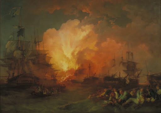
Artist: Phillip James De Loutherbourg, Title: Battle of the Nile, Medium: Oil Painting on Canvas, Date: 1800, Location of artwork: Tate Britain, Source of image file: http://www.google.com/culturalinstitute/asset-viewer/the-battle-of-the-nile/gAFcvDJINN-KrA?projectId=art-project
Figure 2: The battle of Chathan
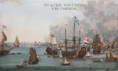
Artist: Willem van der Stoop, Title: Battle of Chatham, Medium: Oil Painting Reproduction on Canvas, Date: 1667, Location of artwork: Skokloster Castle, Source of image file: http://www.google.com/culturalinstitute/asset-viewer/the-battle-of-chatham/sQHd5ywqtvJv6g?projectId=art-project
Works Cited
Tate. Philip James De Loutherbourg. n.d. Web. 27 3 2014.
The Battle of Chatham. n.d. Web. 27 3 2014.
The Battle of the Nile. n.d. Web. 27 3 2014.